I used to stand in my blue bedroom and feel like something was missing. The color was right but the room felt flat. I’d move pillows and sigh.
I learned to treat blue like a mood, not a rule. Small placement choices changed the whole feel. It’s calmer and more deliberate now.
How To Decorate A Blue Bedroom For Maximum Style
This shows you how to make a blue bedroom feel intentional and comfortable. You’ll see how to use blue as a base or an accent so the room reads as styled, not fussy. The end result is a balanced, lived-in space that feels calm and complete.
What This Solves
If your blue walls look cold or your navy bedding feels heavy, this helps. I show how to warm the room, add layers, and place pieces so the color reads as welcoming.
If the room feels unfinished, you’ll get ideas that actually change the mood.
What You’ll Need
- Navy linen duvet cover (queen, stonewashed linen)
- Soft white cotton sheets (300-thread, queen)
- Cream chunky knit throw (50×60 inches)
- Brass adjustable bedside lamp (antique brass finish)
- Natural oak nightstand (small, 1-drawer)
- Woven jute area rug (8×10, natural)
- Patterned blue & cream accent pillow (18×18, linen)
- White ceramic vase (matte, medium)
- Blackout navy curtains (84-inch, thermal)
Step 1: Decide the role of blue in your room
I start by naming blue’s job. Is it the base color (walls), a dominant textile (duvet or rug), or a pop (pillows, art)? Saying the job out loud helps me make choices that support it. When blue is the base, I add warm neutrals to keep things cozy. If it’s a pop, I keep surfaces and large textiles light so the blue reads intentional.
People often pick blues that fight other finishes. Don’t match every blue exactly. A small mismatch creates life. Avoid piling on identical blues everywhere — it reads flat.
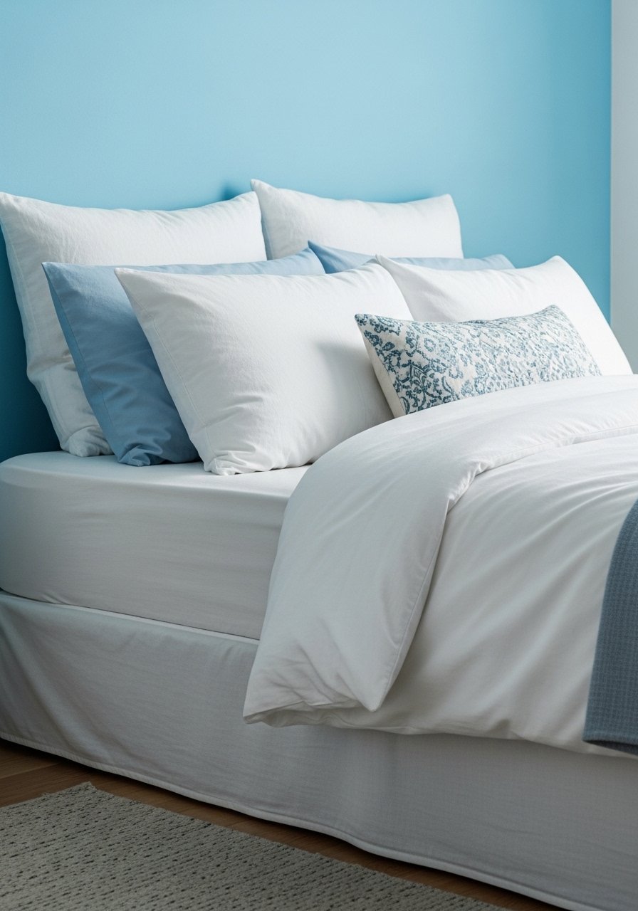
Step 2: Anchor the room with bed and rug
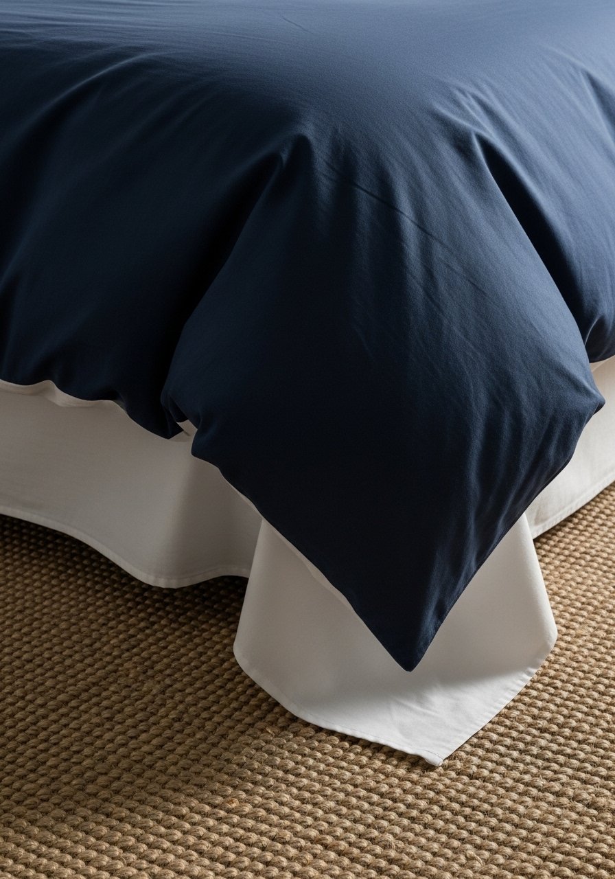
I treat the bed and rug as anchors. The bed decides scale. A navy duvet on a white sheet keeps blue grounded. A natural jute rug under the bed warms the palette and adds texture. Make sure the rug extends beyond the bed enough to make the bed look centered and intentional.
People miss proportion — too-small rugs make the bed float. Avoid shoving the rug only under the feet of the bed; it should sit beneath the front two-thirds of the bed for balance.
Step 3: Layer textiles for comfort and contrast
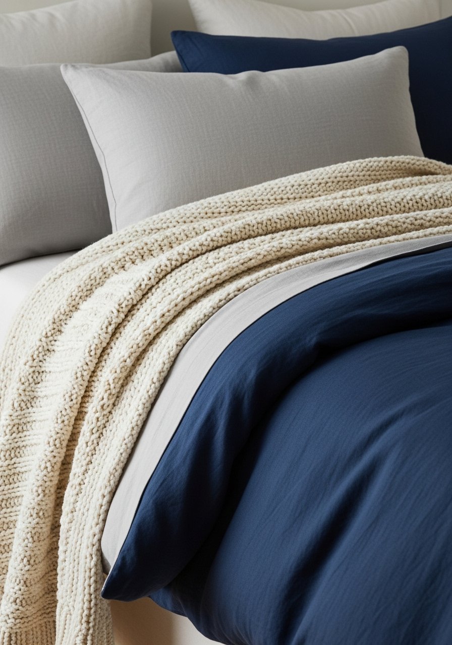
I add layers in this order: sheets, duvet, throw, then pillows. I mix fabrics — crisp cotton, soft linen, a chunky knit — so blue doesn’t feel flat. I keep at least one bright or warm neutral layer (cream throw or white sheets) to break up the blue and add warmth.
The insight most miss is scale of pattern. Small patterned pillows can get lost on a dark duvet. Avoid using every texture at once; keep one dominant texture and two supporting ones.
Step 4: Use lighting and metal accents to add warmth
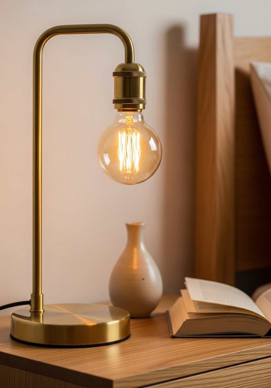
I favor layered lighting — bedside lamp, ambient overhead, and something small like a plug-in sconce. A warm bulb and a brass lamp make a cool blue feel cozy. Place lamps slightly forward on the nightstand so the light reaches the bed rather than just the wall.
People think brighter is better. Too-bright, cool light kills the mood. Avoid placing only one light source on one side; the room feels lopsided. Balance brightness left and right.
Step 5: Style walls and surfaces with breathing space
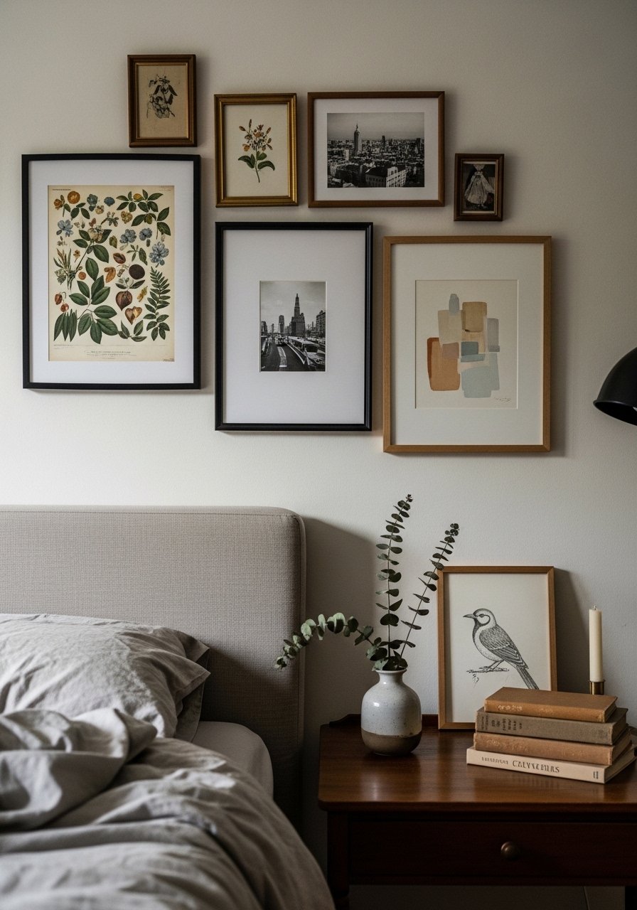
I keep wall art to one or two statements, not a maze of frames. Above the bed, larger, simple art reads better than lots of small pieces. On nightstands, I aim for 2–3 objects: lamp, a vase, and a book. Negative space matters; it lets the blue breathe.
A common miss is overcrowding. Too many small accessories makes the room busy. Avoid matching everything — one contrasting texture or color on a shelf keeps the scene readable.
Layering Textures
Layering textures makes blue feel comfortable. I mix linen, wool, jute, and ceramic in small doses. Start with one dominant texture (linen bedding) and add two supporting textures (wool throw, jute rug).
Tips:
- Use matte ceramics and natural woods for calmness.
- Keep one bright neutral to break up deep blue.
Lighting and Warmth
Lighting changes how blue reads. Warm bulbs and dimmers make navy feel cozy. Aim for at least two light sources near the bed. If overhead light is harsh, add a soft floor lamp or shaded table lamp.
Also:
- Use brass or warm metal finishes sparingly.
- Curtains should soften glare and add depth without darkening the room.
Styling Shelves and Nightstands
I style shelves in small groups, not rows. Use odd numbers and mix heights. Leave empty space between groups so each item reads. On a nightstand, I balance function (lamp, glass of water) with one decorative piece.
Quick rules:
- Group 2–3 objects, varying height.
- Keep surfaces mostly clear for a calm look.
Final Thoughts
Start with one small change — swap the throw or add a lamp. You don’t have to redo everything at once. I always test a single tweak and live with it for a week.
Trust your eye. Blue can be calm, warm, or bold depending on what you pair it with. Make choices that help you sleep better, not show off.