I’d stand in my bedroom holding three tiny paint chips and still feel stuck. The room looked right on paper, but wrong in person. I wanted blue that felt calm, not cold.
I learned to stop guessing and start seeing how the room lives. It made choosing so much easier.
How To Choose Blue Bedroom Paint That Matches Your Space
This is the method I use every time a room feels unfinished. I show how to read light, test real samples, and pair the blue with fabrics and wood. The result is a blue that feels intentional, lived-in, and comfortable — not just "a blue."
What You’ll Need
- 2oz paint sample pots (assorted blues, set of 6)
- Paint swatch cards (assorted neutrals and blues, fan deck)
- Natural linen duvet cover (queen, ivory)
- Curtain fabric samples (neutral cotton/linen pack)
- 5×7 neutral area rug (wool, low pile)
- Warm LED bulb (2700K, soft white) for bedside lamp
- Mood board clipboard (cork and clip, 11×14)
- Muted throw pillows (set of 2, oatmeal and slate)
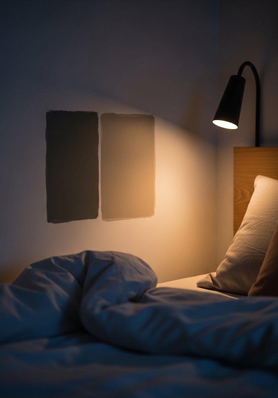
Step 1: Watch the Room’s Light for a Day
I stand in the room at three times: morning, late afternoon, and evening with the bedside lamp on. I watch how the blue reads against daylight and warm light. The color can flip warm or cool depending on the light.
Most people pick a paint chip from a store under fluorescent light. I avoid that. One mistake is judging a color only in one moment. I wait and trust what the room tells me.
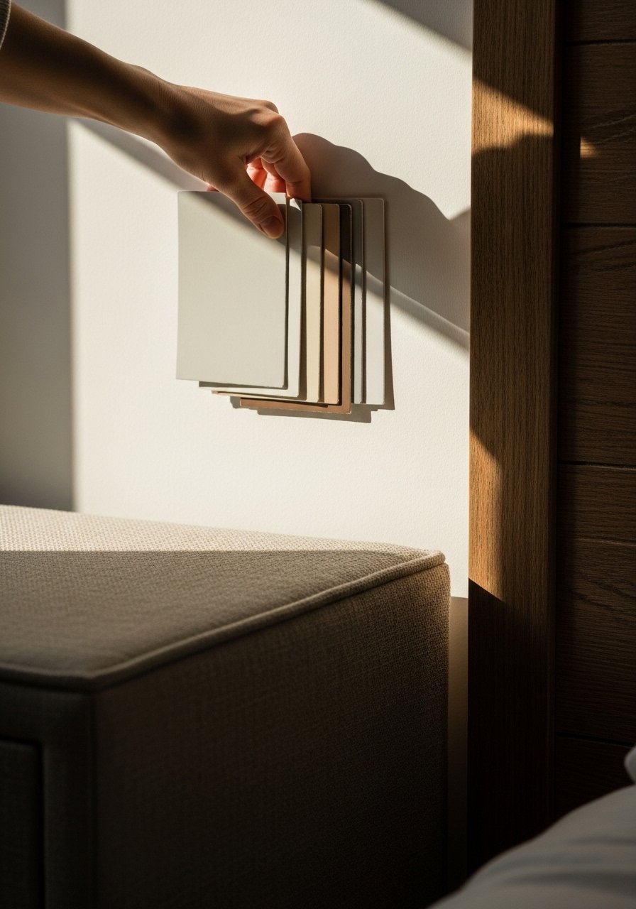
Step 2: Place Real Sample Pots on the Wall
I put four sample pots in a row on the wall, spaced like picture frames. I look for how each patch sits with the bedding and wood tones. The wall suddenly reads different — some blues look flat, others warm and layered.
People often make samples too small or only look at edges. Don’t pick the one that looks best in isolation. Pick the one that works with the bed, curtains, and wood together.
Step 3: Live with Samples for Three Days
I sleep with the samples up. I sit with a cup of tea and stare at the wall. I notice one blue feels cozy at night, another feels washed out under the lamp. Small moments tell me more than a quick glance.
The insight people miss is emotional: which blue makes the room feel calm to sit in. Don’t rush to paint the whole room based on a single afternoon’s impression.
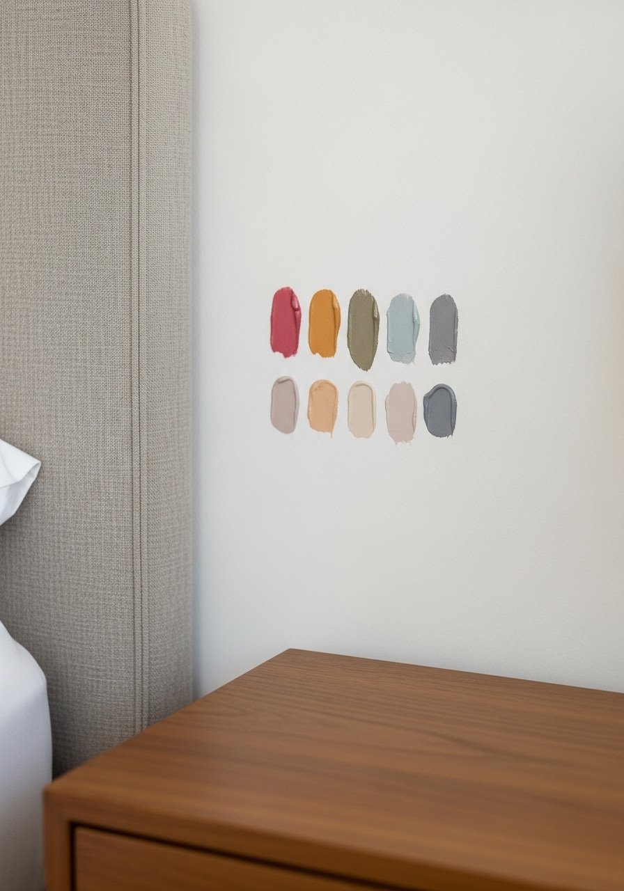
Step 4: Check Undertones and Finish
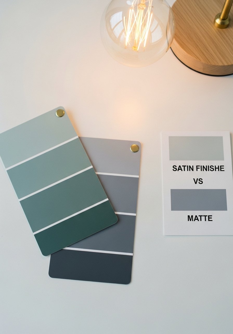
I compare the chosen sample to swatch cards and think about undertones — is it leaning green, gray, or true blue? I also decide finish: matte softens flaws; satin adds warmth and slight sheen. This changes how deep the color feels.
A common mistake is ignoring undertones and finish. Two blues can read completely different once you add texture and light. I pick both color and finish together.
Step 5: Balance the Blue With Textures and Neutrals
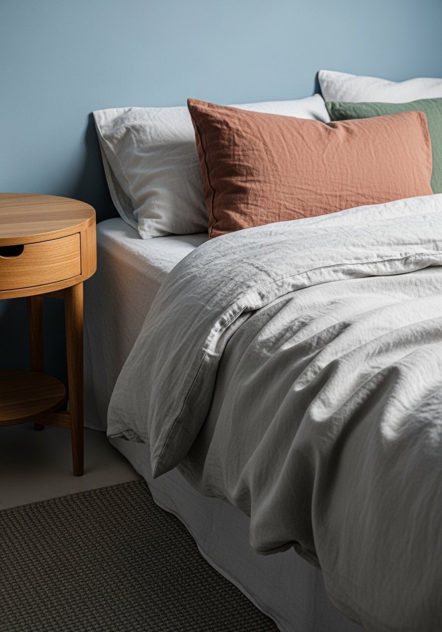
I place the bedding, rug, and curtains against the painted wall before committing. The blue needs anchors: warm wood, a neutral rug, and soft linen. That balance keeps the blue from feeling cold or too dominant.
People either match everything too closely or clash wildly. Avoid choosing all cool-toned decor with a cool blue. A tiny bit of warm wood or cream fabric makes the blue feel comfortable and lived-in.
How Light Changes Blue
Blue shifts a lot with light. North-facing rooms often deepen blues into moody tones. South-facing rooms can make the same blue look brighter and airier. I always test samples at different times.
Even the lamp matters. A 2700K warm bulb warms the blue and makes it cozy. Keep that in mind when you judge samples at night.
Pairing Blues With Neutrals
I aim for three neutrals when I pair blue: warm wood, off-white linen, and a grounded rug. This simple palette keeps the room calm.
Quick pairings I use:
- Blue wall + natural linen duvet
- Wood nightstand + wool rug
- Muted throw pillows tying the blue to textiles
These small anchors make the blue feel intentional.
Simple Test Checklist
I use a short checklist before I commit: view at three times of day, compare with linen and wood, live with samples three nights, decide finish, and place a warm bulb in the lamp. It keeps decisions simple.
If one item fails the checklist, I tweak the sample or swap one neutral. Small adjustments save big repainting headaches.
Final Thoughts
Start with a small sample and live with it. I let the room’s light and my favorite textiles make the choice easy.
You don’t need the “perfect” blue. You need the blue that feels right in your life. Take it slow and trust what you see.